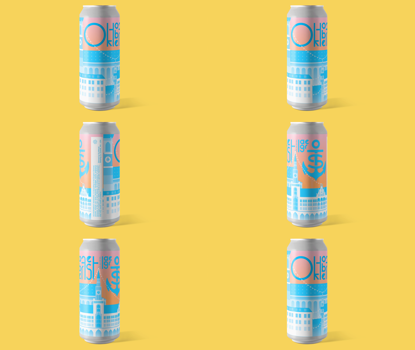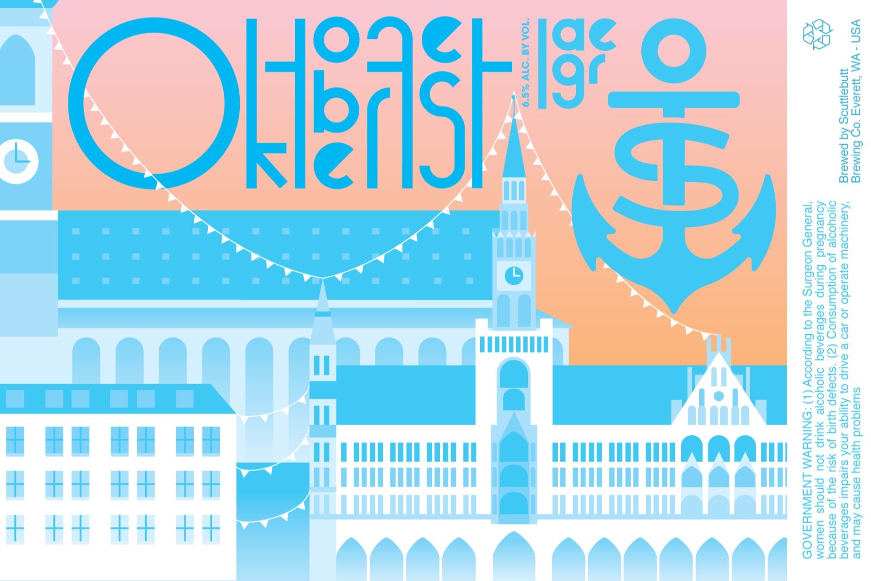
Oktoberfest Lager Label
Details
Scuttlebutt Brewing Co. makes a variety of unique beers, but in the past their label design has failed to exemplify their delicious beer that they’re so proud of. To keep there cans from blending into the rest of the beer aisle they’re in need of a paradigm shift.
Timeline
2 weeks
Roles
Designer
Illustrator
Type
Layout
Tools
Adobe Illustrator
Adobe Photoshop

The Project
Scuttlebutt is making a beer for the upcoming Oktoberfest celebration and in order to be competitive they’re looking to create a label for their lager that has real shelf appeal. Scuttlebutt in the past has had labels mostly focused on their anchor logo, which is beautiful, however they wanted to stray away from using it and move towards something more unique and expressive like their beer so we were given two weeks to come up with a concept and then execute.
After some research…
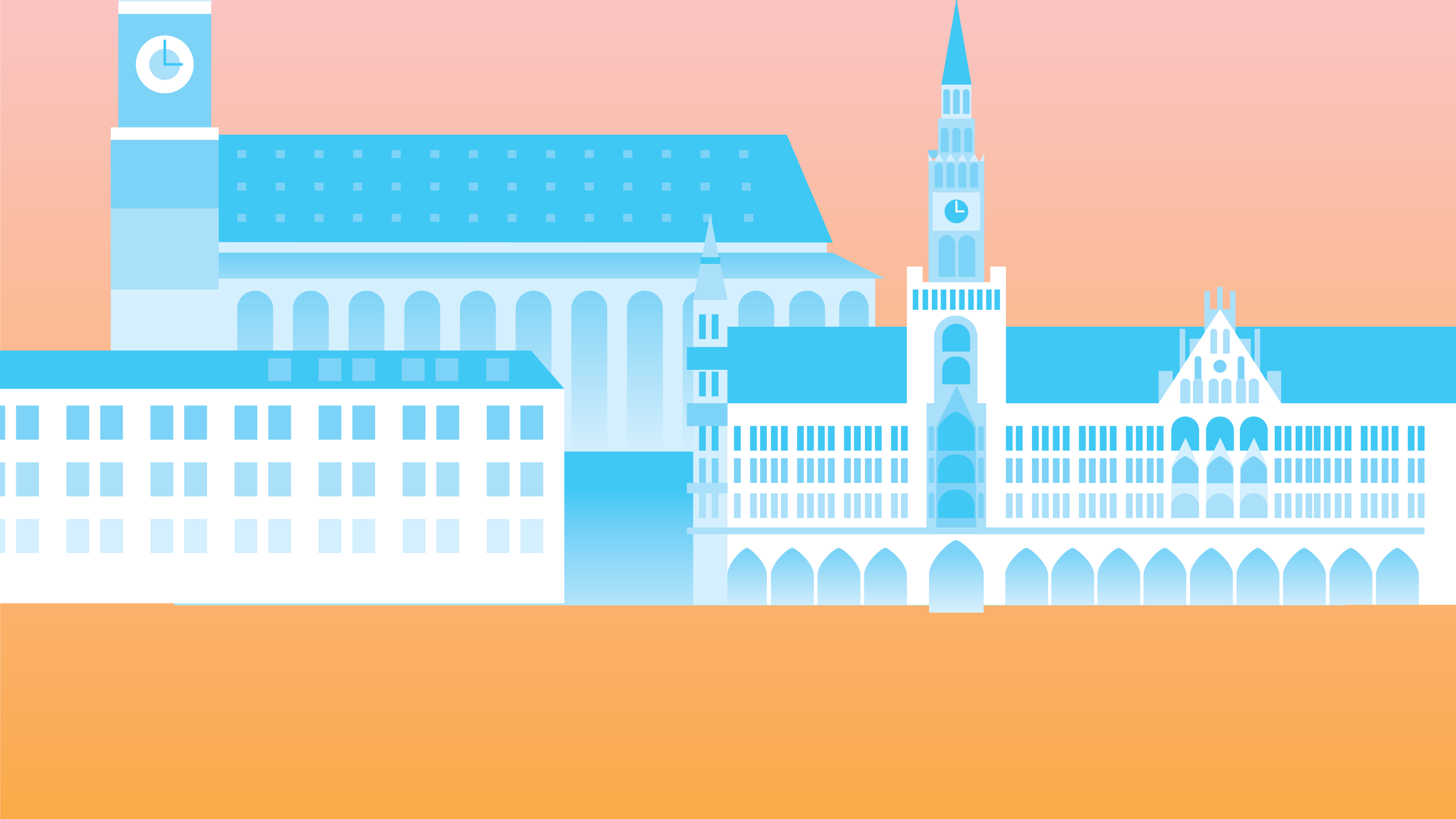
Following the marriage of King Ludwig I of Germany and Princess Therese there was a banquet held in their honor to which they invited entire the public. This began the tradition of Oktoberfest, the world’s largest beer festival. In Germany the holiday is celebrated over the span of 16-18 days and almost 2 million gallons of beer was drank there . I dipped heavily into this theme, making vector illustrations of the Munich skyline, including famous buildings and small fun details of their architecture.
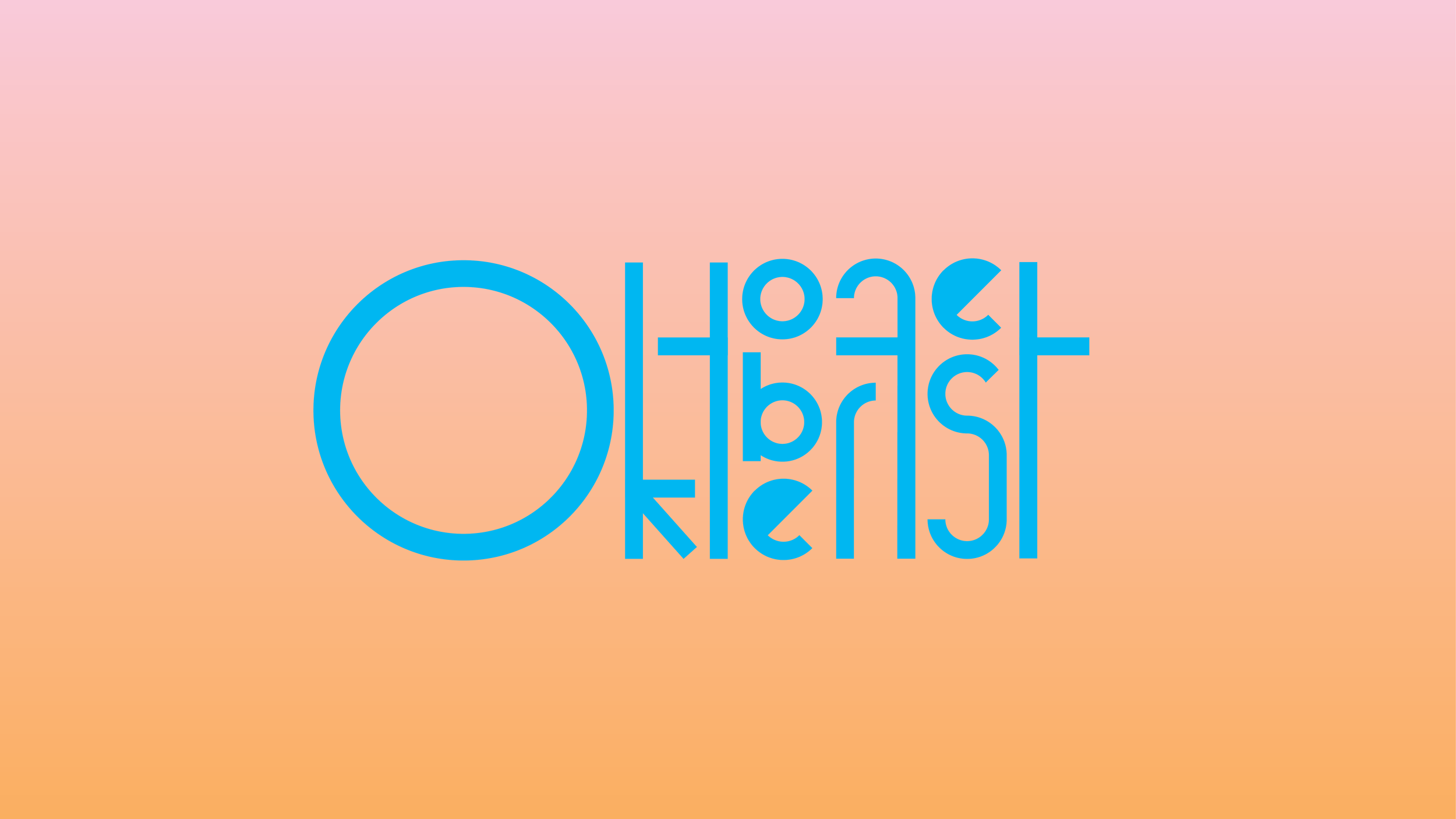
The color scheme is derivative of the holiday’s classic light blues and white to some of the other pastel accents. Inspiration for the type was derived from the same the simple geometric shapes I used to create the architecture of the cityscape. Expressive and bright enough to stand out from every other can, but simple enough to retain legibility. All of these elements come together into this eye catching can that successfully captures this celebration.


